Improving User Progress Pages
As an online platform we have quite a lot of information about the way our students have answered our questions; the ‘My Progress’ page is the way we let students see an overview of how they’re doing. These pages are also visible to any teachers that students may be connected to, allowing teachers to see not only the progress of assignments set but also if their students are doing work on their own too.
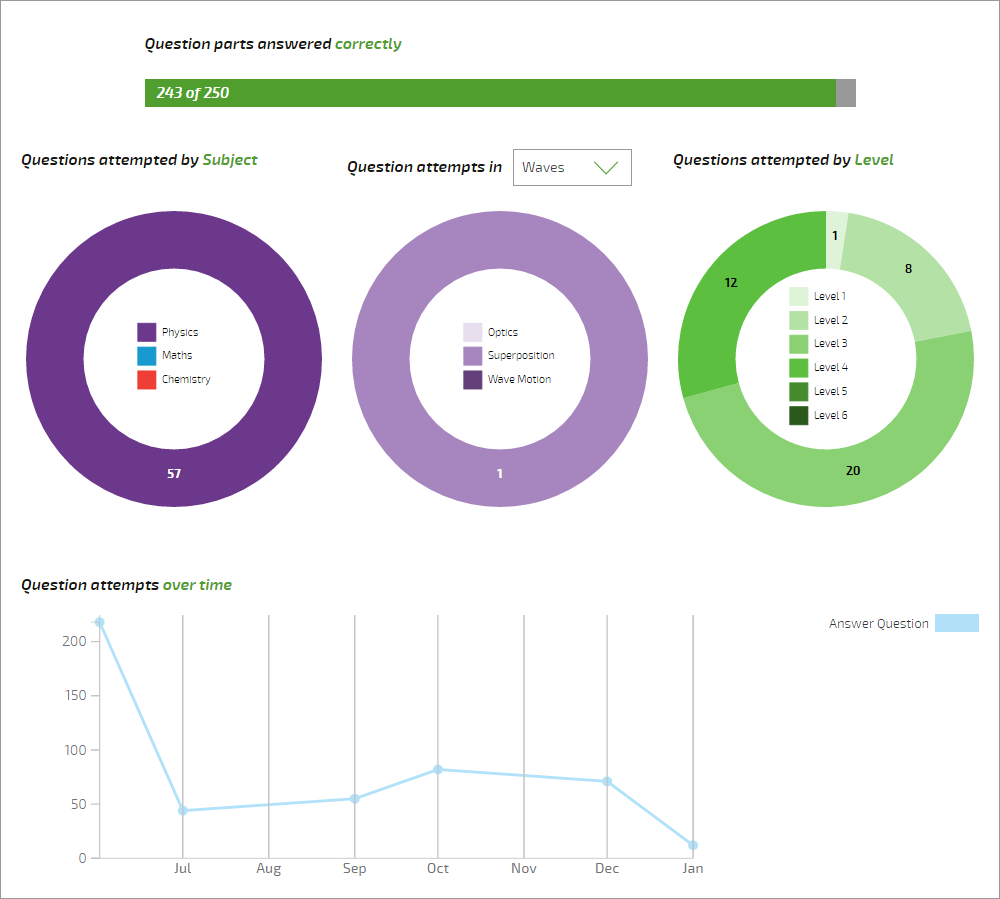
Our old progress pages didn’t give too much information beyond how many question parts were correct, which topics of the problem-solving questions had been attempted, and a timeline of attempts over time:
We actually know a lot more about the questions that students have been attempting than this, so we’ve tried to add more to the page. On the way we’ve run into several interesting questions; What counts as a question on Isaac? being the most awkward!
For the sake of argument, our question pages (or hexagons on boards) we call ‘questions’: they have subjects, topics and levels associated with them. Each question page can contain many ‘question parts’: these are individual sections requiring an answer; they don’t have levels or subjects directly but they are the places where students do their hard work. A question is considered correct when all the question parts it contains have been answered correctly. But because some question pages contain only one part, and others 30 parts, it’s best to provide information on both whole questions and the question parts to students!
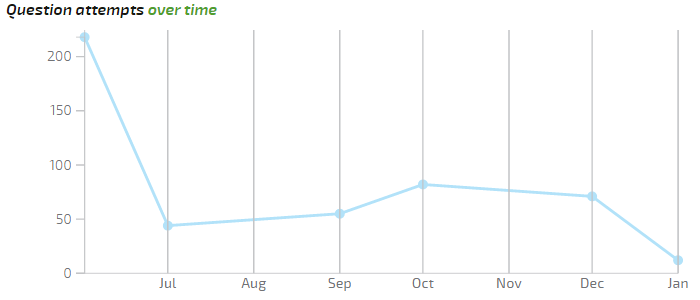
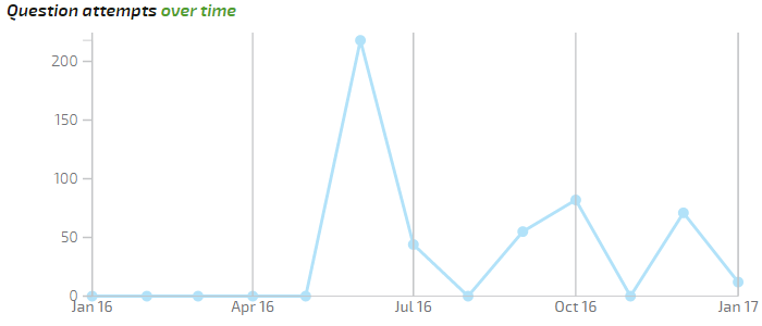
The profile page also contained a chart showing how active the student had been, in terms of attempts per month. This is easy to fake, because you can just get a question wrong time and time again; but combined with an idea of how many questions the student has answered it’s more useful. However the chart itself was terrible; the time axis was badly scaled and irregular, and the months where no attempts had been made weren’t shown at all, producing a misleading plot:
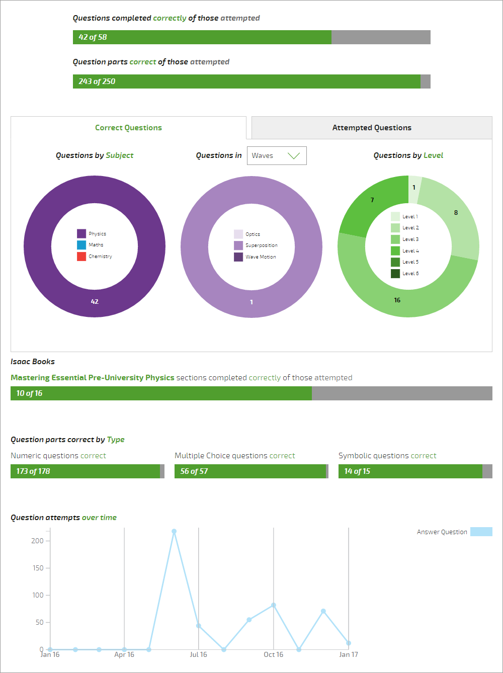
We also know the types of questions students have tried: were they all multiple choice, which you can always get right by continual trying; or perhaps our new symbolic questions, which are harder and require more algebraic skill? We now show how many of each type have been tried and how many have been answered correctly, and do the same for subjects and topics too. We also include stats on questions from our book, which were totally absent before; although currently they only show how many sections are completely correct, we’ll add how many Mastery has been achieved in at a later date.
All this leads to a much improved ‘My Progress’ page:
There’s still scope for improvement, and we welcome suggestions on what students and teachers would like to see on it!

James Sharkey
James is a physicist turned computer scientist, working both on physics and computing for Isaac