Visualising Data in New Ways
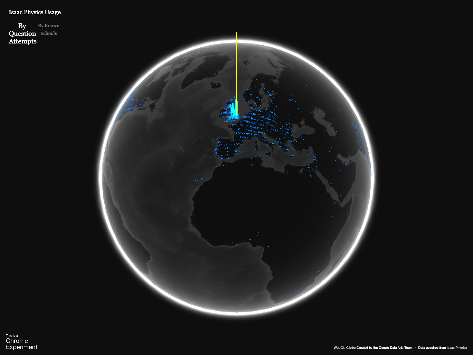
Isaac has seen nearly 7.1 million question attempts over the last 2 years, and as a research-oriented platform we collect data about these attempts. One incidental piece of information we have is a rough idea of where in the world people are attempting our questions from. We can’t use this data for research, because it’s not very reliable; it’s based on IP address, and doesn’t necessarily reflect where a user really is.
But we don’t need an accurate location to have fun visualising it - just a rough idea will do!
Enter Google’s WebGL Globe, a Chrome Experiment for visualising geographic data in a novel way; the taller the spike on the map, the more “stuff” has happened at that location. What would happen if we made a heat-map like plot of where people answered questions on Isaac from?

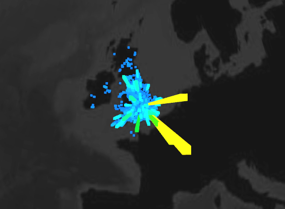
We can also look at the locations of schools in the UK and Ireland which have students and teachers registered at. We have postcode and Eircode information for these schools, and can show an indication of how many users are active at each. Of course, many students haven’t told us their school, and so the data is necessarily incomplete. But as a quick way of visualising where Isaac is being used, it’s quite cool!

You can explore the globes yourself here, though they may not work if you’re not using Chrome.

James Sharkey
James is a physicist turned computer scientist, working both on physics and computing for Isaac